
This post is also available in Dutch.
You regularly come across graphs on television, in the newspaper and on the internet. Unfortunately, reading graphs is not always easy, and critically assessing them, even less so. Yet this is crucial, because not all graphs always represent data fairly and, thus, can give you a distorted picture. In order to learn to read graphs better, here are two useful tips!
1. Pay attention to the axes
Often when you see a graph, you first look at the title and the overall pattern, as they seem to be the most important for understanding the graph. To illustrate this, let’s look at the graph below. This graph with RIVM data shows how many people tested positive for Corona on 3rd November 2020. The average number in the municipalities in the Dutch provinces of Gelderland and Utrecht is shown. We can conclude from the title and graph that, in general, there were more positive test results in Utrecht than in Gelderland. And, at first glance, this seems like a pretty dramatic difference.
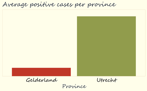
Although it is clear from this graph that, on average, there were more positive tests in Utrecht, it is, of course, not clear at all how big that difference actually is. To find out, it is very important to take a good look at what the heights of the blocks actually mean. That is, we need to look at the vertical axis (also called y-axis) of the graph.
When examining the graph below, it is striking that it has been zoomed in. The average numbers of positive tests are shown here on an axis of 14 to 20, which makes the difference between Gelderland and Utrecht seem larger than it actually is.
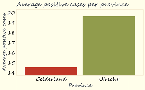
For a fairer display of data, it would be good to have values on axes start at zero. After all, the purpose of this particular graph is to display numbers as the height of a block. Consequently, it is better if the height of the block is actually representative of the difference in values. In this case, the value of Utrecht (19.6) is approximately 1.3 times as high as the value of Gelderland (14.5). It is only fair if the green block of Utrecht is also about 1.3 times as high as the red block of Gelderland. This can be achieved by starting the axis from zero.
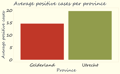
When doing so, as in the graph below, our first impression is very different: instead of a huge difference in height between the two blocks, we now see a smaller difference. It is important to always take a good look at this, because zooming in like this can make differences seem bigger than they are. And by zooming out, someone can actually make differences seem smaller.
2. Beware of omitted information
In the graphs above we have only seen the average depicted in the height of the block. That is of course not very informative: this could have as easily been transmitted by saying “The average number of positive tests on 3rd of November was 14.5 in Gelderland and 19.6 in Utrecht”. And this is a shame, because a graph can easily convey more information – remember: “a picture is worth a thousand words”.
Sometimes the omission of information is a way to display data differently from reality, whether intentional or accidental. For example, we currently do not know how many municipalities have been included per province. In the worst case, the creator of the graph could have included only the municipality of Oldebroek for Gelderland and only the municipality of Zeist for Utrecht.
In addition, we do not know how much variation there is between municipalities within each province. If all municipalities in Utrecht had about 20 new infections and all municipalities in Gelderland had about 15, then there are indeed fewer infections in the Gelderland municipalities than in those in Utrecht. But if there is a lot of overlap between the numbers for the Gelderland and Utrecht municipalities, then the average difference of 5.5 is less meaningful. So we also want to see how much variation there is.
That is why there is another graph below, which shows the data in no less than two ways. Each coloured dot on the left represents a municipality. The colour and location of the dot indicate which province a municipality belongs to, and the height indicates how many positive tests there were in that municipality on 3rd of November. For example, we see that in Gelderland there were 11 municipalities with 0-5 positive tests (the bottom row contains 11 red dots), and in Utrecht 7. We also see that there are 51 red dots and 26 green ones, which corresponds exactly to the number of municipalities in Gelderland and Utrecht. Fortunately, there are more municipalities than Oldebroek and Zeist included!
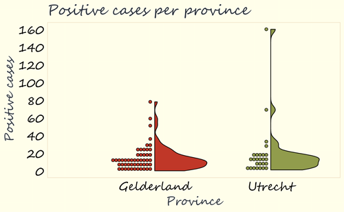
On the right, we see the distribution of the number of positive tests per province in a slightly different way. The wider the shape, the more often that number of positive tests relatively occurred. We see that numbers between 0 and 40 were most common in both Gelderland and Utrecht, because the shapes are the widest there. When seeing this variation, it is striking that Gelderland and Utrecht are actually very similar. The big difference is that in Gelderland the maximum number was around 80, and in Utrecht around 160.
Could this explain the difference in means? Yes, indeed it could! When we remove the municipality in Utrecht which has a number of around 160, the average in Utrecht falls from 19.6 to 14.0, very similar to the 14.5 in Gelderland. The conclusion we have drawn from the first figure – that there are many more positive corona tests in Utrecht municipalities than in Gelderland – is therefore not in line with the more nuanced picture that emerges here. This is because it concerns a single municipality where the number of infections is much higher. Although we should not let our conclusions about the province Utrecht be biased by this outlier, seeing this outlier in the graph is a good start for investigating what is going on in this municipality and what can be done to halt the spreading of the virus there.
Finally, before we can conclude anything from graphs like these, it is crucial that we understand the underlying data really well. For example, to interpret these data, it is essential to know how many people actually live in each municipality and province, or to know how many people were tested. We should think critically about the underlying data, as well as the graphs themselves.
So the next time you come across an interesting graph, try to pay attention to the info on the axes, and be wary if any information is omitted from a graph. By doing so, you will be less easily fooled by misleading graphs.
Credits
Original language: Nederlands
Author: Marlijn ter Bekke
Buddy: Jeroen Uleman
Editor: Wessel Hieselaar
Translator: Ellen Lommerse
Editor translation: Mónica Wagner
Photo by Markus Winkler via Unsplash