This post is also available in .
UX Design
User Experience Design, commonly shortened to UX Design, is the process of designing a (technological) product with a user’s entire experience of the product in mind. That means a product has to be not only useful but also easy and intuitive to use, and it has to have a pleasant look and feel. For example, an app may have all the information on a certain topic and therefore be very useful. However, if the app has colors such that it hurts your eyes to read it, the app would be neither usable nor desirable. Clearly, taking into account the user experience of an entire phone is more complex than just picking the nicest color. How do UX designers know whether such a phone provides a great user experience? That is where psychology comes in.
Insights from psychology
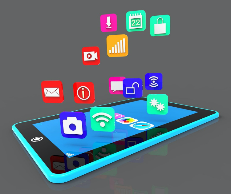
UX designers can rely on insights from psychology when researching new products such as smartphones. In the research phase, UX designers might be interested to learn about the psychological effects of different features that they can put on smartphones. For example, one study looked at how quickly people could find the right apps when the apps had different background colors or were the same color, and when the apps were represented as text or as icons. They found that people were significantly faster when the menu items had different colors and displayed an icon rather than a textual description of the apps’ content (as in the picture below).

Something else that designers of a phone may be interested to learn about is smartphone addiction and what causes it. One team of scientists analyzed the psychological mechanisms at work in some of the most addictive smartphone apps, including Facebook, WhatsApp and Candy Crush. One psychological mechanism they found in the apps is social pressure. One example of this is the pressure you may feel to respond to your contacts in WhatsApp when they know you saw their message due to the appearance of two ‘blue ticks.’ Another is the endowment effect, which means that the more time and/or money you invest in something, the more difficult it becomes to let go of it.
UX designers have reacted to studies on smartphone addiction by adding apps to measure screen time, which let users know which apps they spend the most time with. By learning about the way people behave with a product, UX designers can make informed decisions during the creation of the product. This way, psychology helps shape the devices we use every day.
Author & Translator: Maria den Hartog
Buddy: Rebecca Calcott
Editor: Marisha Manahova
Editor Translation: Felix Klaassen
Cover Image by Andy Bright via flickr
